Analyzing COVID-19 data

Introduction
In the early stages of COVID-19 in late 2019 and early 2020, individuals having its symptoms visited a clinic for diagnostics. The clinic took their blood samples and was able to run a full blood test, including PCR test, on every individual of 6568 between November, 2019 and August, 2020. The dataset contains 33 features measures in the blood samples. Below are the features measured in the individuals’ blood samples. The response feature is the PCR outcome - (the outcome of a test for COVID-19).
| Patient_ID | MCHC_31_36_gdl | Basophils |
| gender | MCV | Basophil_0_100 |
| age | MCV82_98fl | Eosinphils |
| date_collected | RBC_count | Eosinphils_50_500uL |
| Hematocrit | RBCCount3.9_5.0uL | Neuts |
| HCT_35_45 | RDW | Neutrophils_1700_8000 |
| HGB | RDW_11.5_16.5 | Monocytes |
| HGB12_15.5_gdl | Total_WBC_Count | Monocytes_300_900 |
| MCH | WBC_Count_3.5_10.5uL | Plt_Counts |
| MCH_26_34_pg | Lymphocyte | Platelet_150_450uL |
| MCHC | Lymphocyte_900_2900 | PCR_outcome |
Aim and objectives
The aim of the analysis is to obtain a model that most accurately classifies the PCR_outcome given the predictors using the autoML algorithm. The objectives in this analysis are listed as follows:
- Data cleaning.
- Data exploration.
- Data sampling.
- Data modelling.
- Model Evaluation.
Tools: R, R-Studio, Quarto, Tidyverse, Plotly & h2o.
Data Cleaning
The dataset used was imported into R-studio and the first step was to convert features into their appropriate type. We also discovered a missing observation and the decision was to exclude the observation since the consequence, the percentage data loss will be insignificant.
df <- df |>
  mutate(
    gender = as.factor(gender),
    date_collected = as.POSIXct(date_collected, format = "%d/%m/%Y"),
    HGB = as.numeric(HGB),
    PCR_outcome = as.factor(PCR_outcome)
  )

# Just a missing observation in age. We can omit this.
df<- na.omit(df)
Data Exploration
In this section, we use graphs to explore some important features in the dataset.
Area Chart: The area chart below shows the distribution of patients that visited the clinic per month, in relation to their PCR outcome. You may click on points on the plot to explore more.
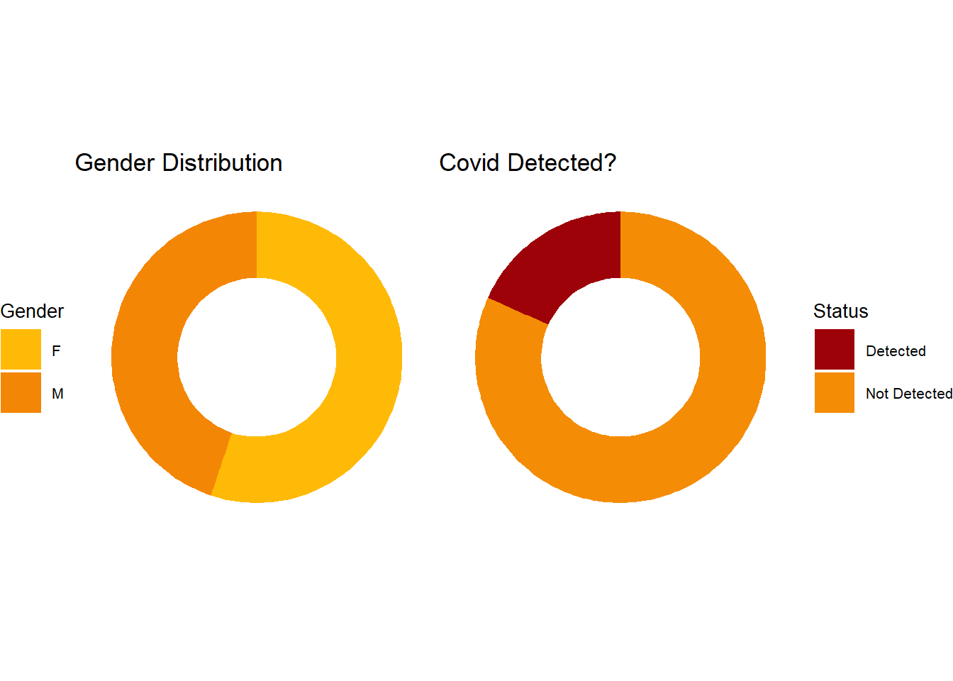
Doughnut plots: The doughnut plots below shows the gender distribution and PCR outcome distribution for all patients during the period.
Bar charts:
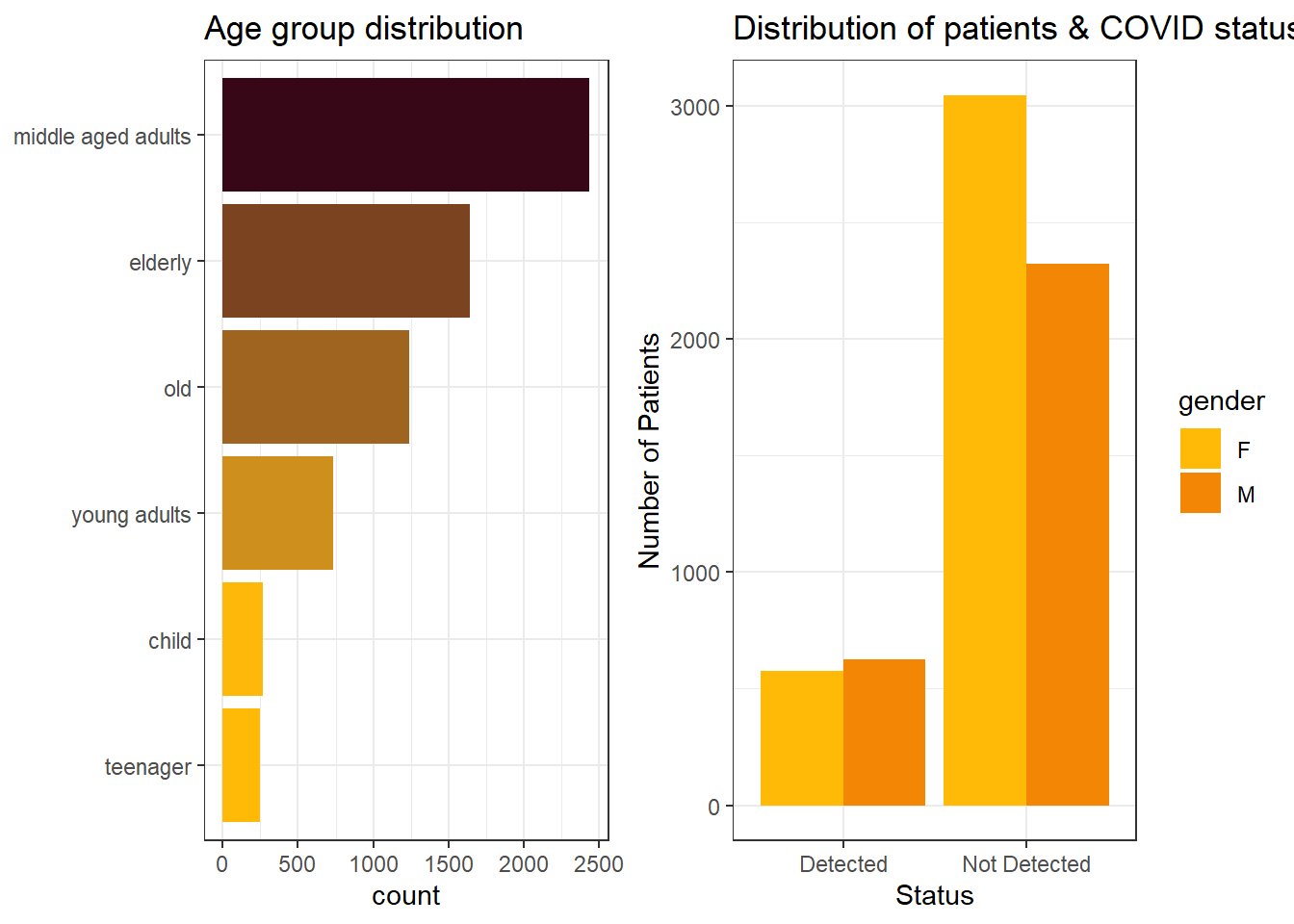
We binned age feature into categories, ranging from child to old. The plot on the left shows the number of individuals in different age groups. The plot on the right shows the distribution of patients gender, in relation to COVID status.
Important features
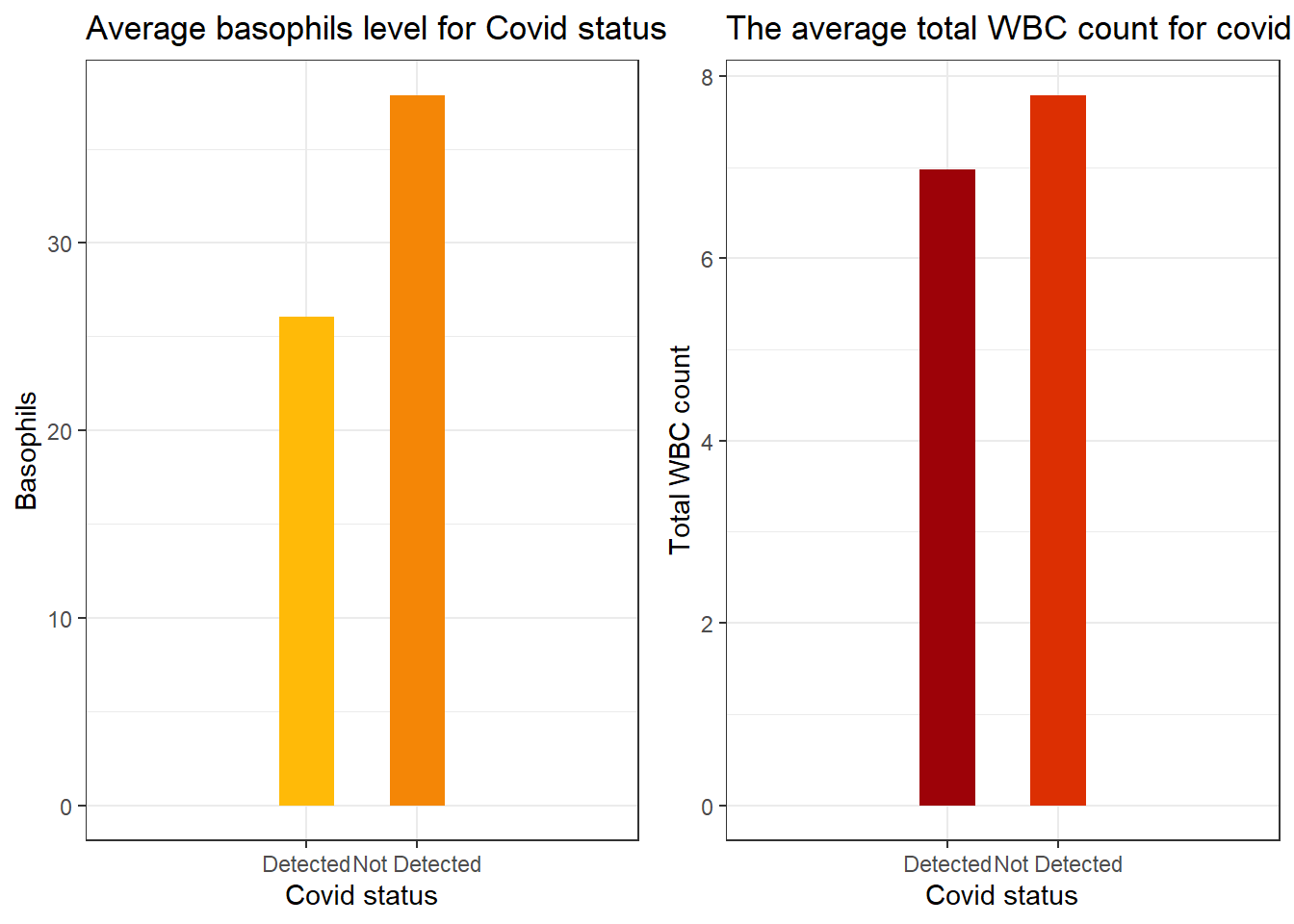
We discovered the top important features as indicated by XGboost, one of the models from the autoML processes. Below are plots showing the levels of these features for both cases of PCR outcomes.
The plot on the left shows the average basophils level for both PCR outcomes. We may observe that for patients with the virus present have their basophils level significantly lower than patients without the virus.
Also the plot on the right shows the average total white blood cell count for both PCR outcomes. We may observe from the plot that patients with the virus has lower white blood cells on average than patients without the virus.
Total white blood cell count for each age group
The plot below shows the average white blood cell count for each age group. We may observe that children (Aged 0 -12) has the highest average count of white blood cells while the elderly (aged 45 - 60) has the least average white blood cells.